
Bart Matusiak Little Leaf
ux/product designer + information architect
LINK Driver
mobile application

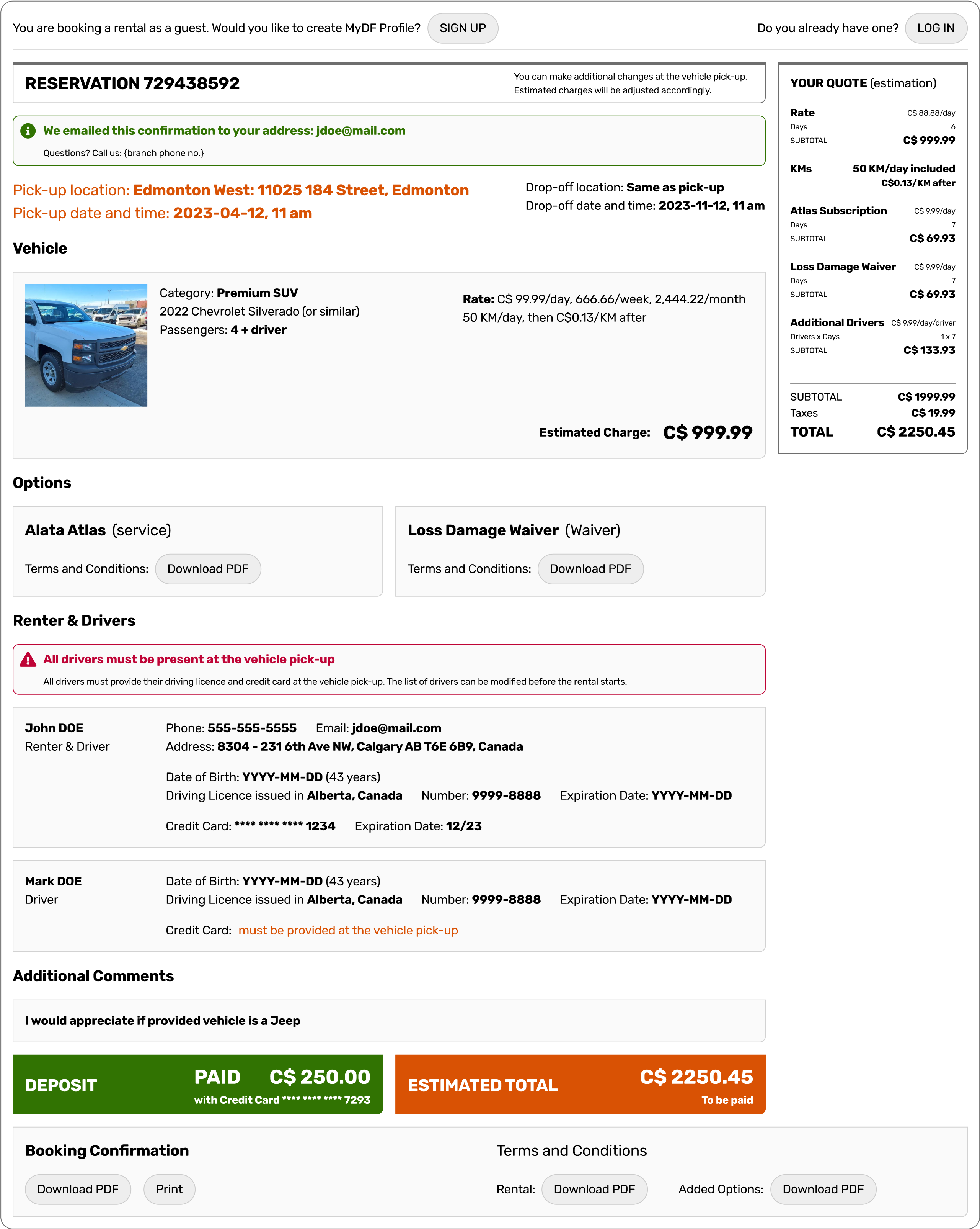
DF Booking
web application module
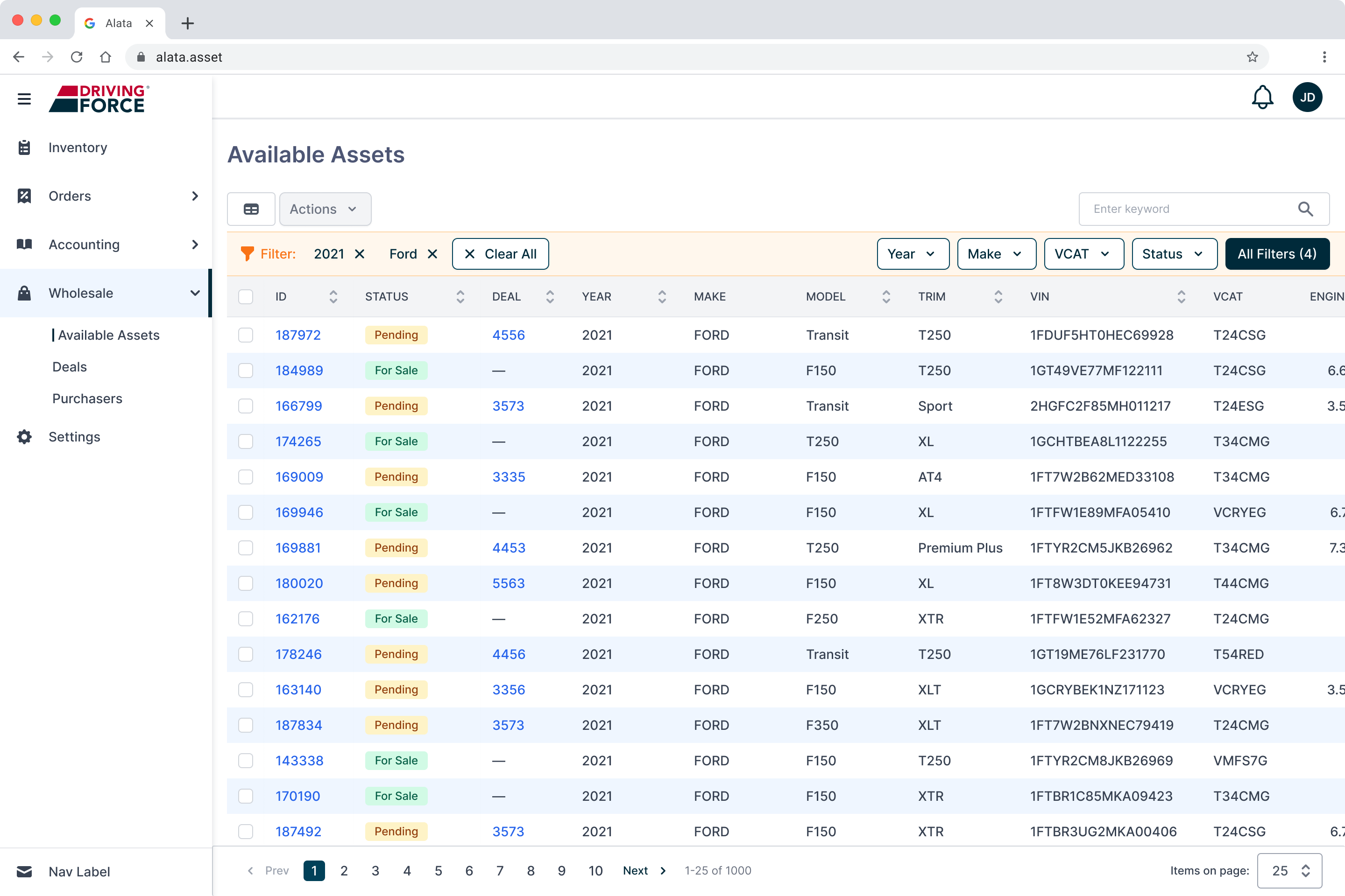
US Wholesale
web application module
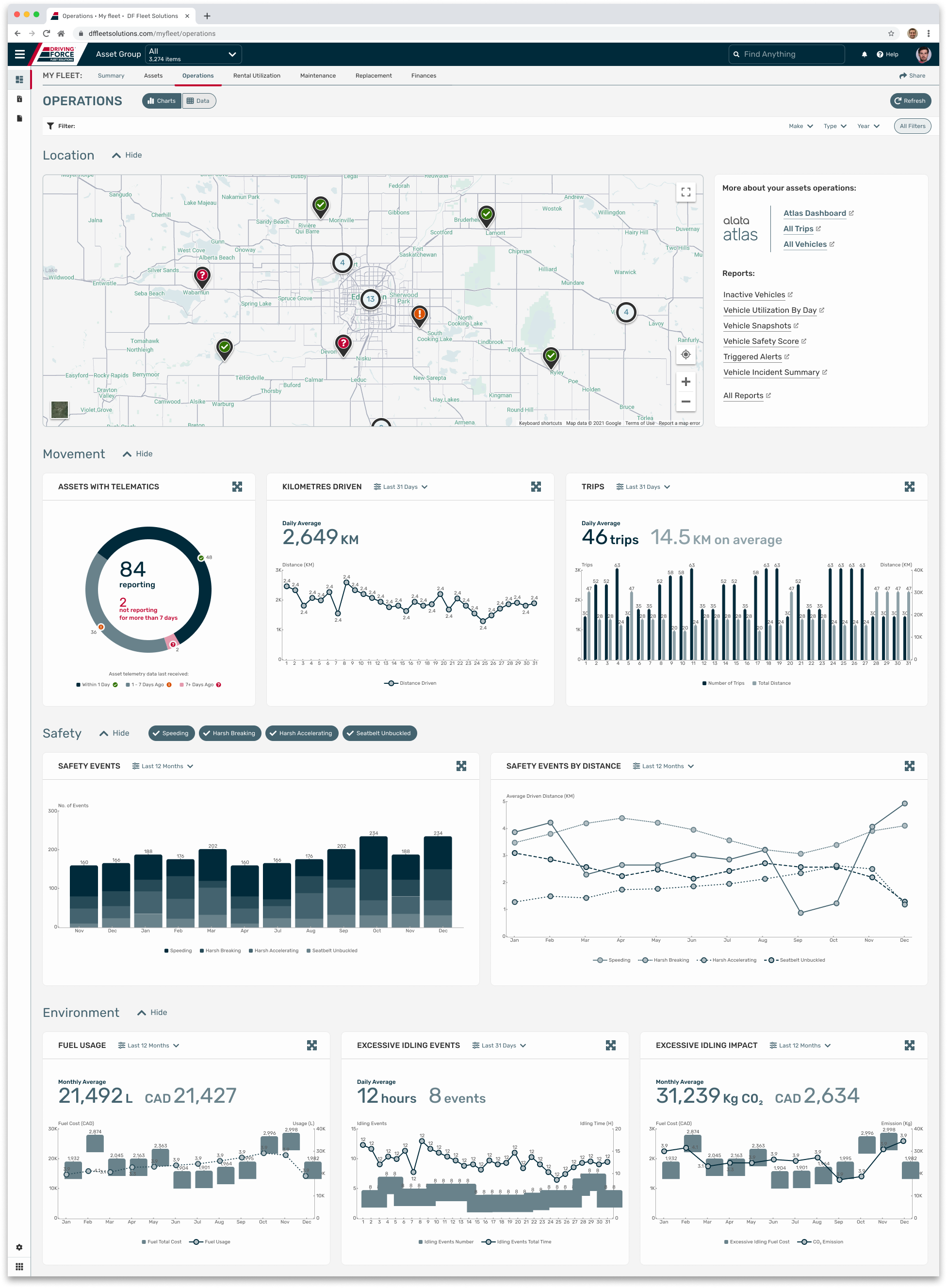
Data Dashboard
web application module
IDs
data taxonomy concept
AL DS
design system
AL Design System (AL DS)
Design system as a comprehensive set of components, templates, rules and patterns utilized to construct the Alata LINK (currently: Alata Fleet), a robust fleet management suite of applications. Project for Alata Tech (part of The Driving Force Group of Companies).
My role: define tokens and design components, identify and design templates, establish patterns and standard flows. Test, maintain and grow the system. Collaborate with the development team to implement and utilize the system.
SITUATION
When building a complex and robust fleet management suite of applications that covers the whole lifecycle of assets, it is important to keep all the parts of this product consistent and coherent to ensure a seamless user experience and straighten the learning curve.
TASK
To build a design system based on Atomic Design principles: the idea is to break down user interfaces into small, reusable building blocks (like atoms in chemistry) and then systematically combine them to create more complex structures.
ACTION
Defining tokens, designing component library and templates, establishing patterns and flows. Preparing documentation. Cooperating with the engineering team to build components and utilize them.
RESULT
Implemented design system speeded up developer re-work time by 40%, according to the development team.
i
See below selected fragments of the whole design system.
Tokens
Tokens are the smallest elements of a design system used to define colours, typography, spacing and other building blocks, parameters and variables.
Colours:
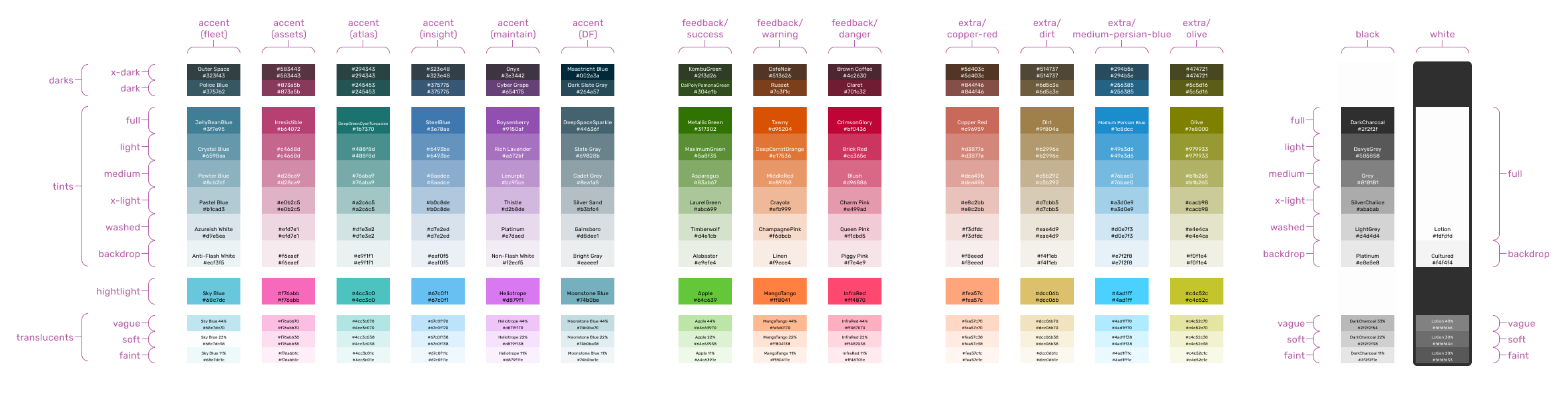
← SCROLL→
Typography:
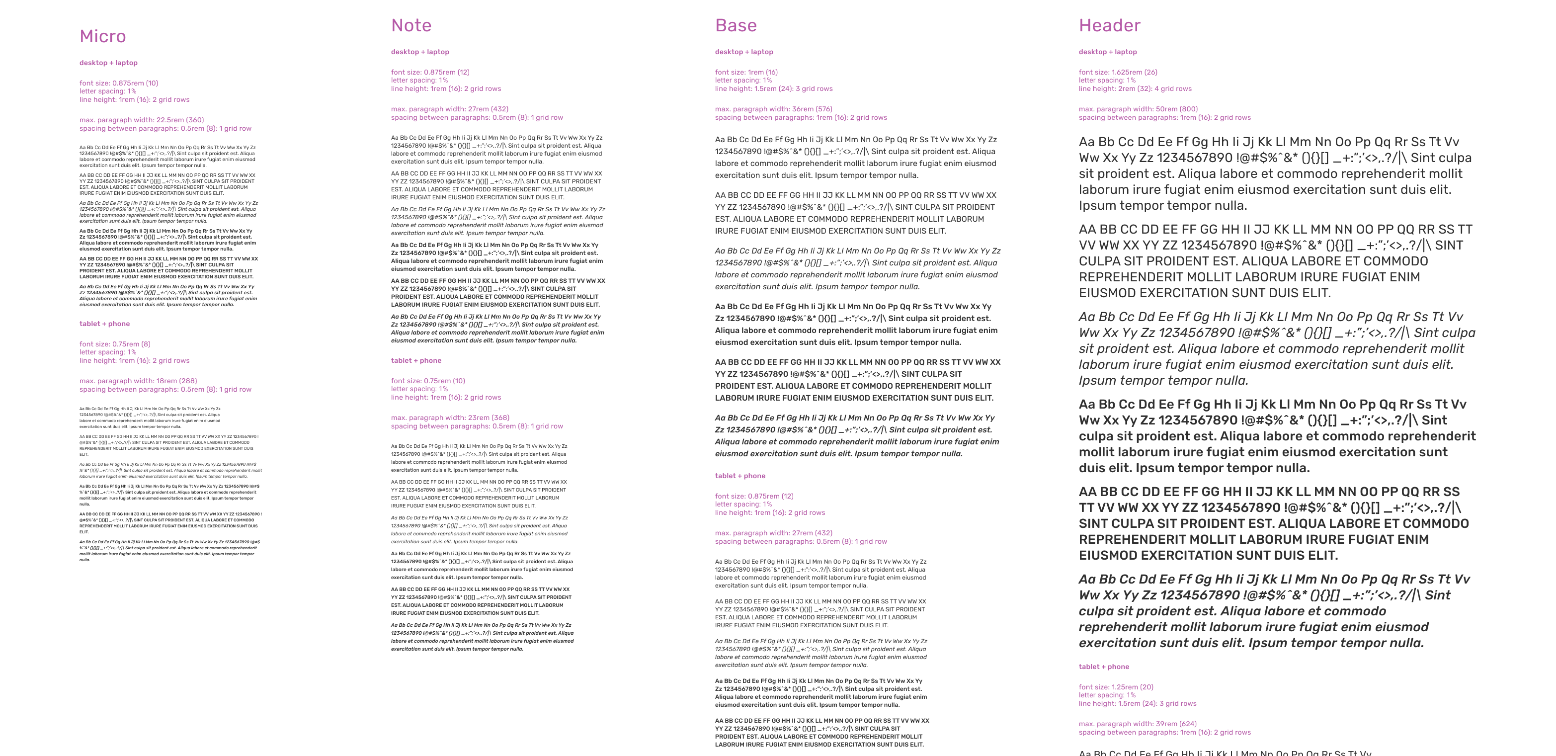
← SCROLL→
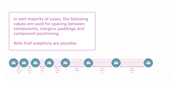
Spacing:
Elevation:
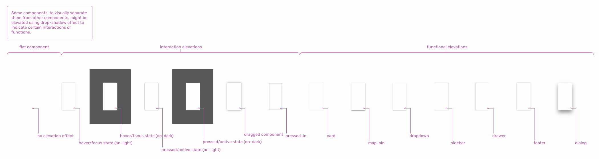
← SCROLL→
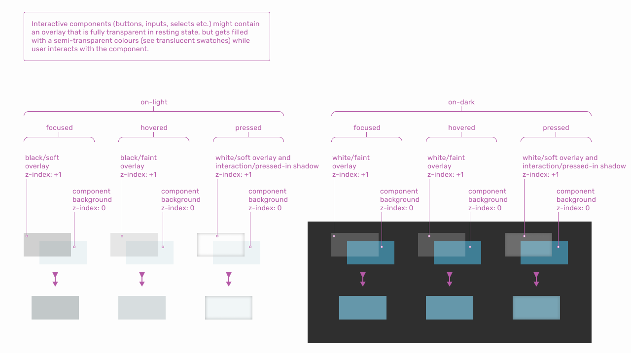
Overlays:
← SCROLL→
Glyphs:
SVG shapes used as an icon component parameter.
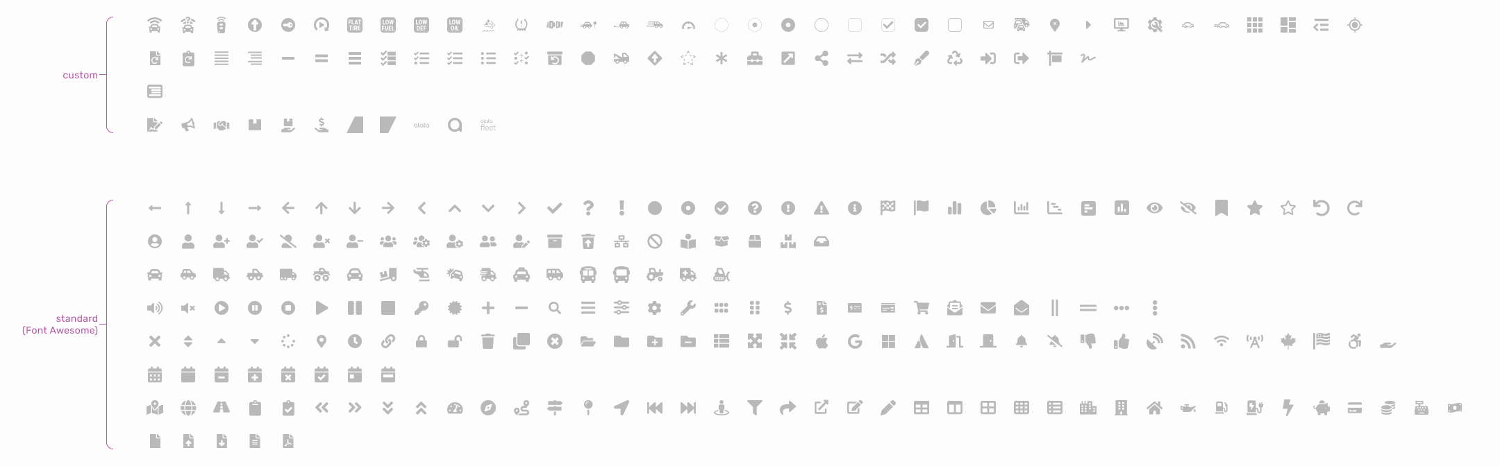
← SCROLL→
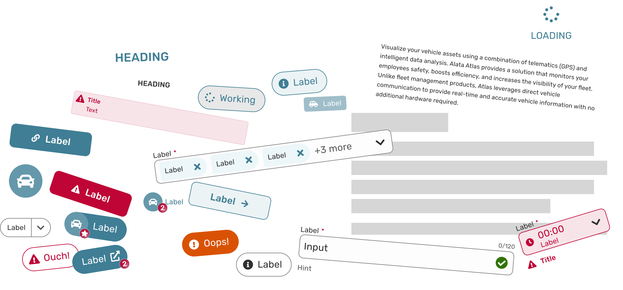
Components Dependances
Following atomic design principles, defined components constitute a hierarchy. Some components are dependent, meanig they can’t be applied directly, but they are used within components of higher complication. Independent compontents can be applied directly, but they can also be used to build other, more complicated components.
Following atomic design principles, defined components constitute a hierarchy. Some components are dependent, meanig they can’t be applied directly, but they are used within components of higher complication. Independent compontents can be applied directly, but they can also be used to build other, more complicated components.
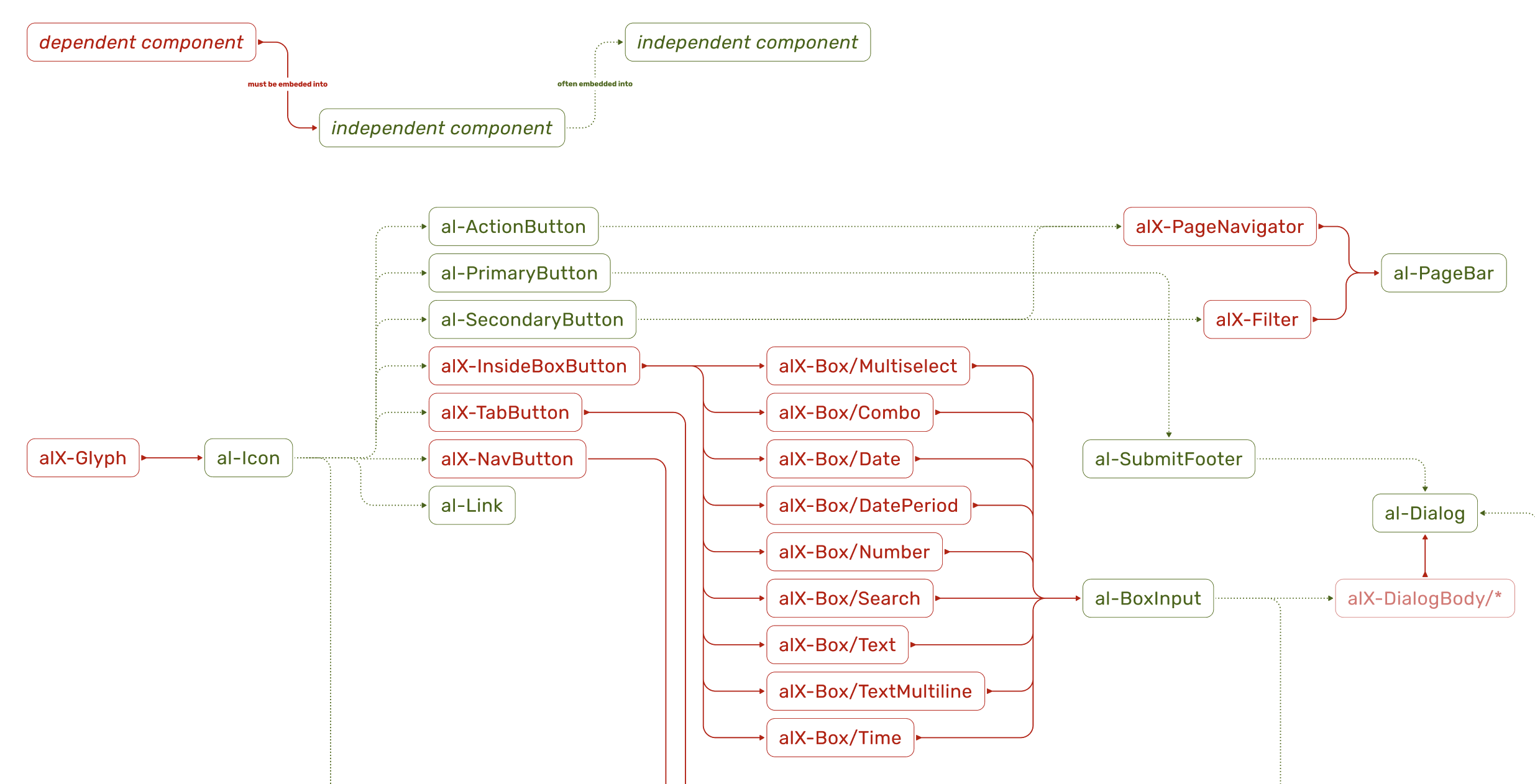
← SCROLL→
Atoms & Molecules
Atoms are the most basic UI elements such as buttons, input fields, labels or icons. These are the raw building blocks with no smaller meaning in UI terms. Molecules are groups of atoms working together, ex. a search form (input field + label + button). Molecules provide simple functionality by combining atoms.
Icon:
Icon atom utilizing glyph tokens. Additional parameters (right) allow full control of the component.
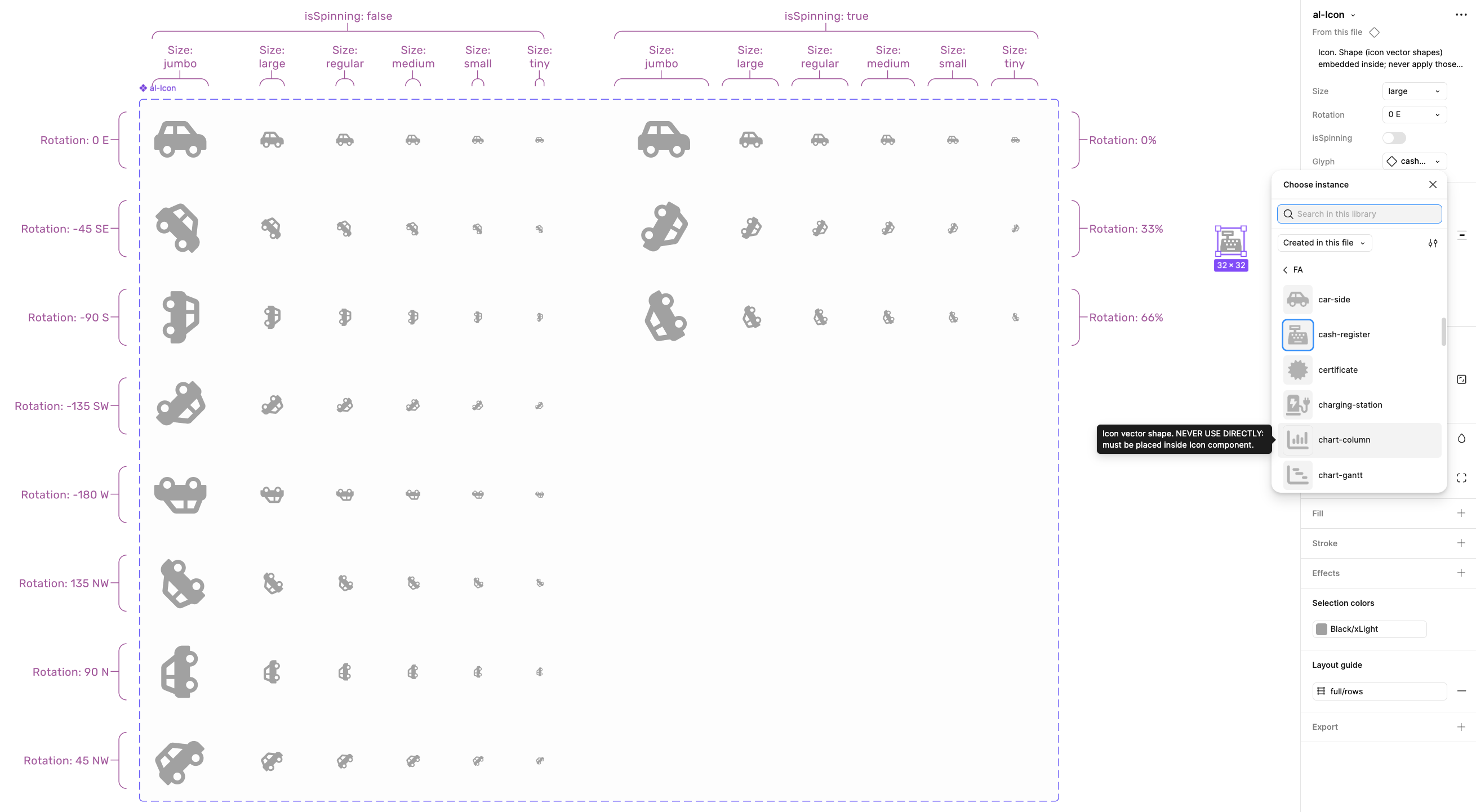
← SCROLL→
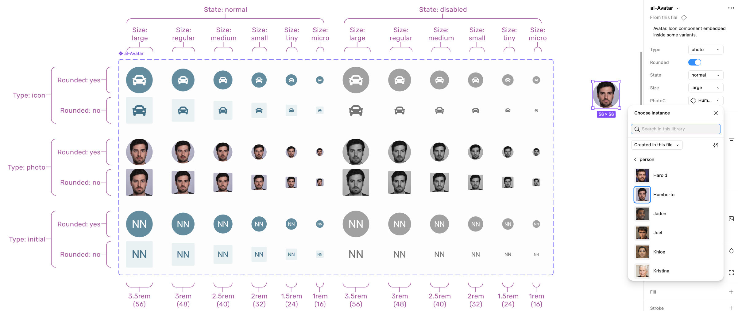
Avatar:
Avatar molecule utilizing Icon atom. Additional parameters (right) allow full control of the component.
← SCROLL→
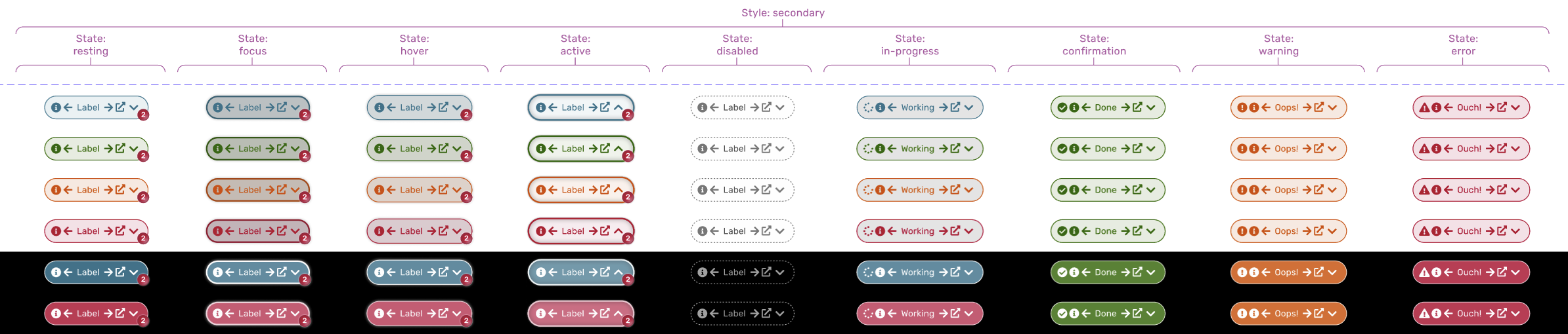
Button:
Fragment of the button molecule design showing selected variants for secondary style. Buttons utilize multiple Icon atoms, depending on situation.
Prototype animation showing button behaviour and micro-interactions.
← SCROLL→
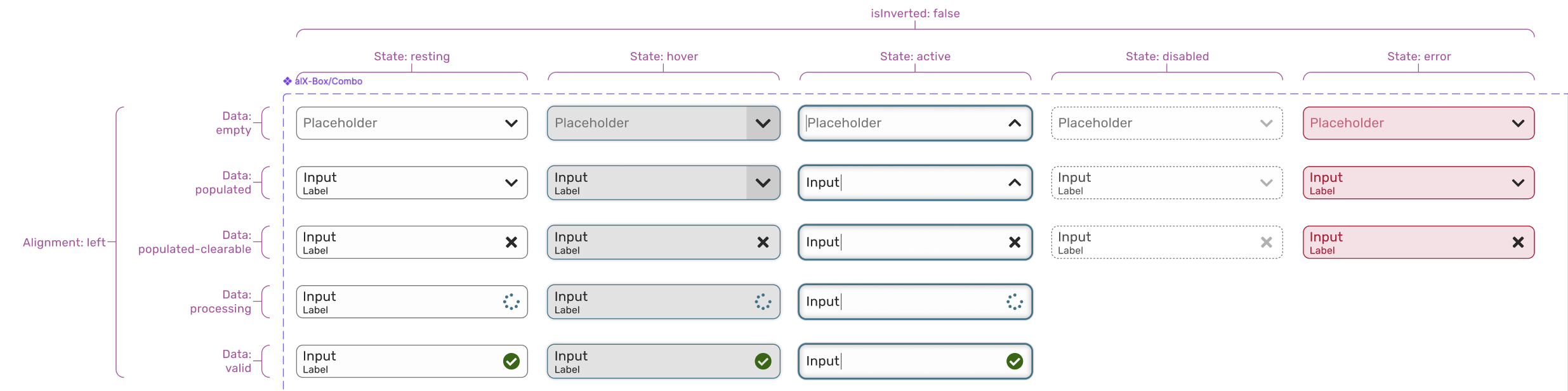
Box:
Fragment of the Combo molecule design showing selected variants. There are also other box types available, such as Text, Search, Date, Time, etc. Those components are not supposed to be applied directly.
← SCROLL→
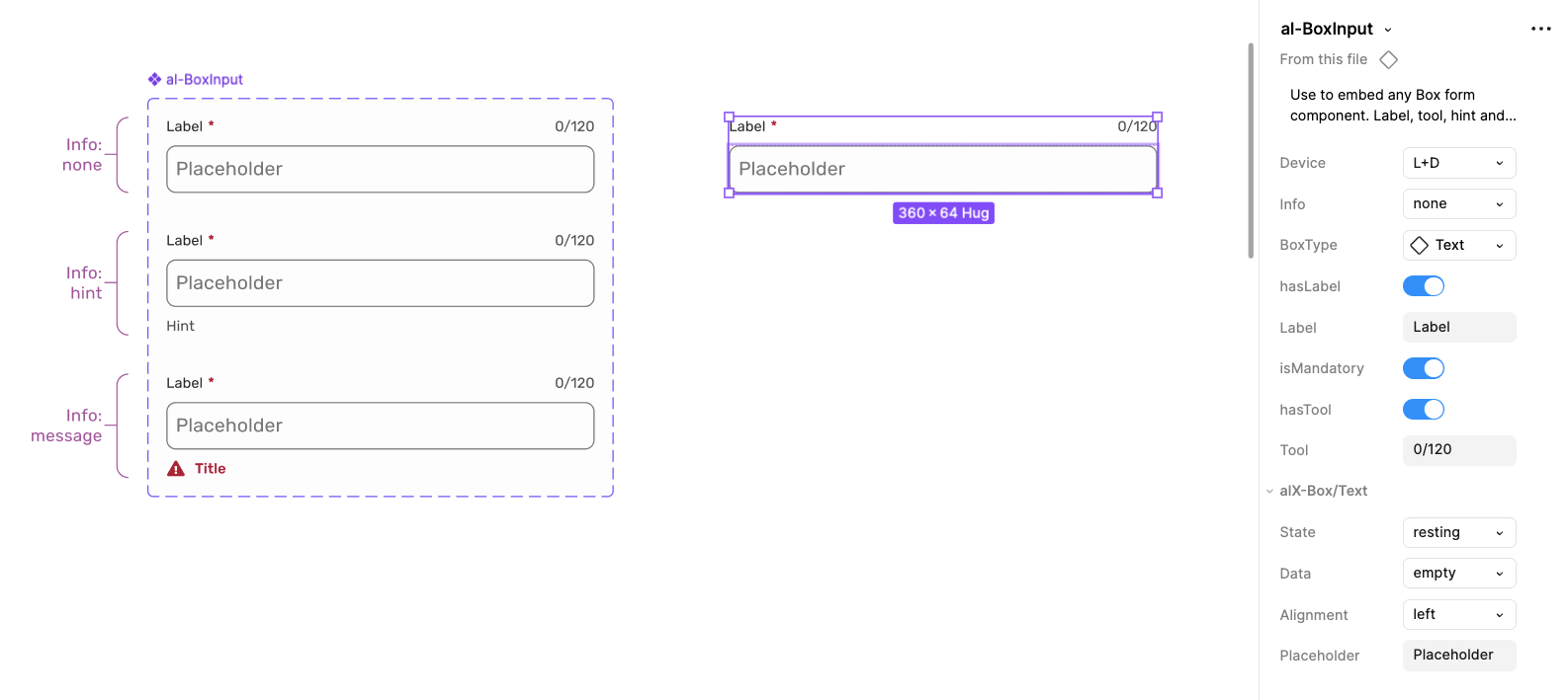
BoxInput:
This component purpose is to apply various kinds of box molecules. Type of the applied box is one of the component parameters (in this case: Text). It adds additional features, such as label, hint, mandatory marking, etc.
← SCROLL→
Organisms
Organisms are relatively complex components made of molecules and atoms (a navigation bar, product card, or header). They establish distinct sections of a UI.
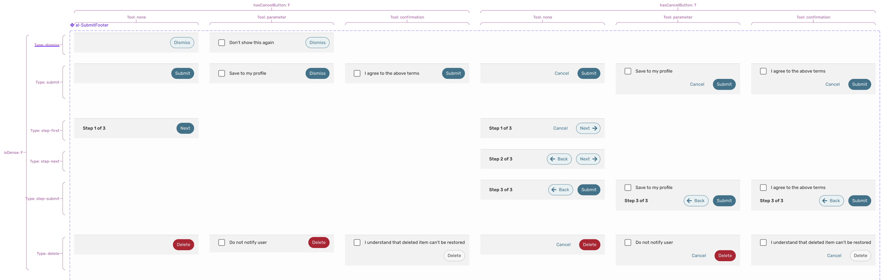
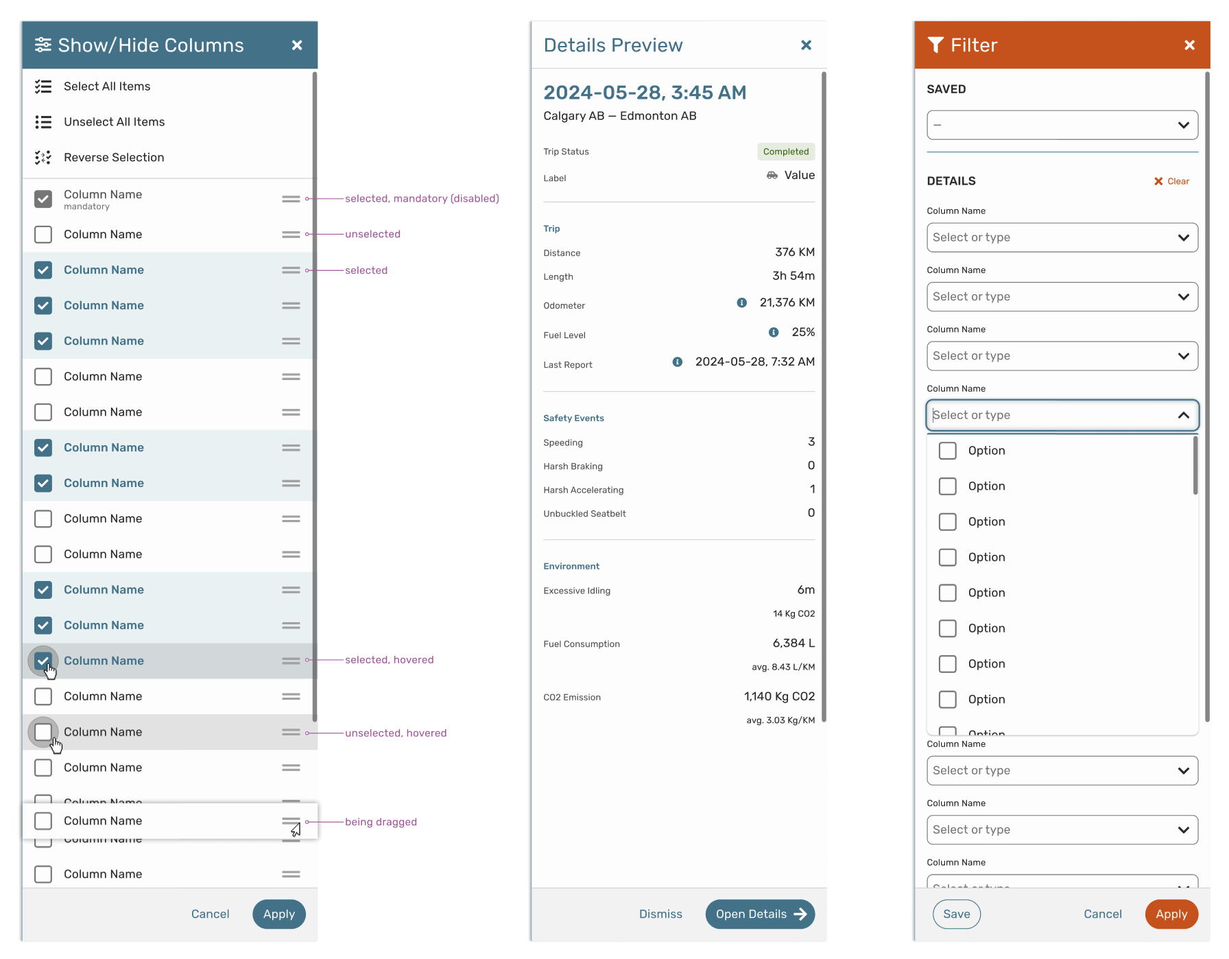
SubmitFooter:
This organism is used by other components whenever there is a need for a submission functionality. The component is built using some atoms and molecules such as SelectBox and Buttons. Shown below are selected variants of the component that cover all identified use cases.
← SCROLL→
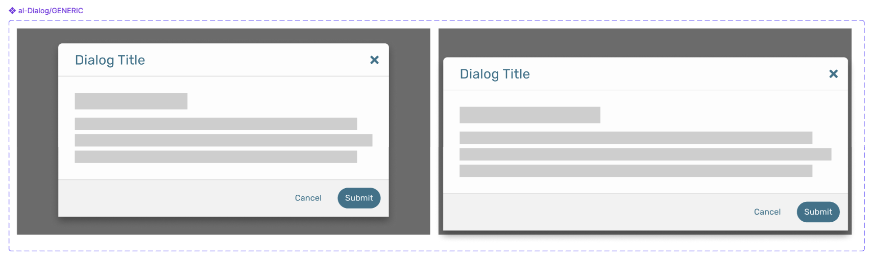
Dialog:
Dialog is one of the components that utilizes SubmitFooter organism mentioned above, as well as DialogTitle.
← SCROLL→
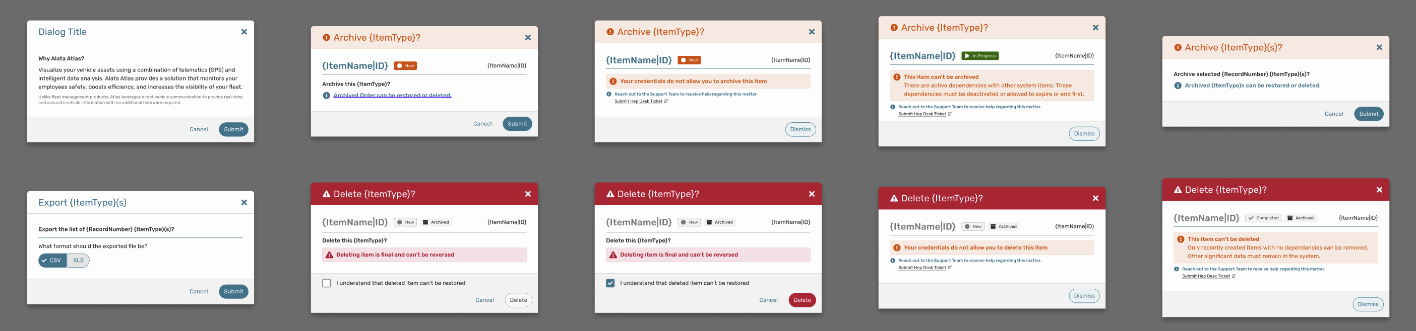
Shown below are Dialog examples with various type of content embeded within.
← SCROLL→
Drawer:
Drawer is another component that utilizes SubmitFooter organism mentioned above.
← SCROLL→
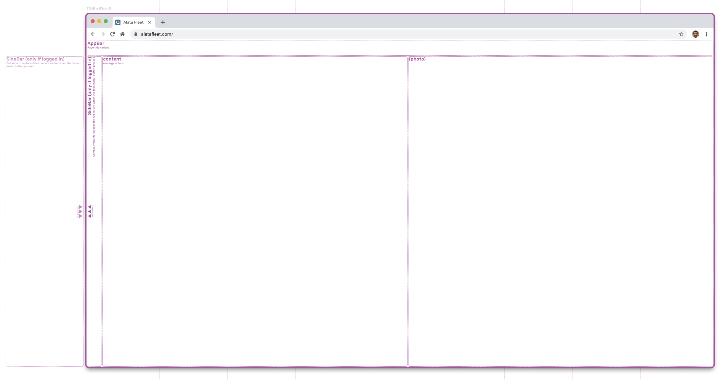
Templates
Templates are page-level structures that arrange organisms. They focus on layout rather than final content, ex. a product page template showing where header, sidebar, and content blocks go.
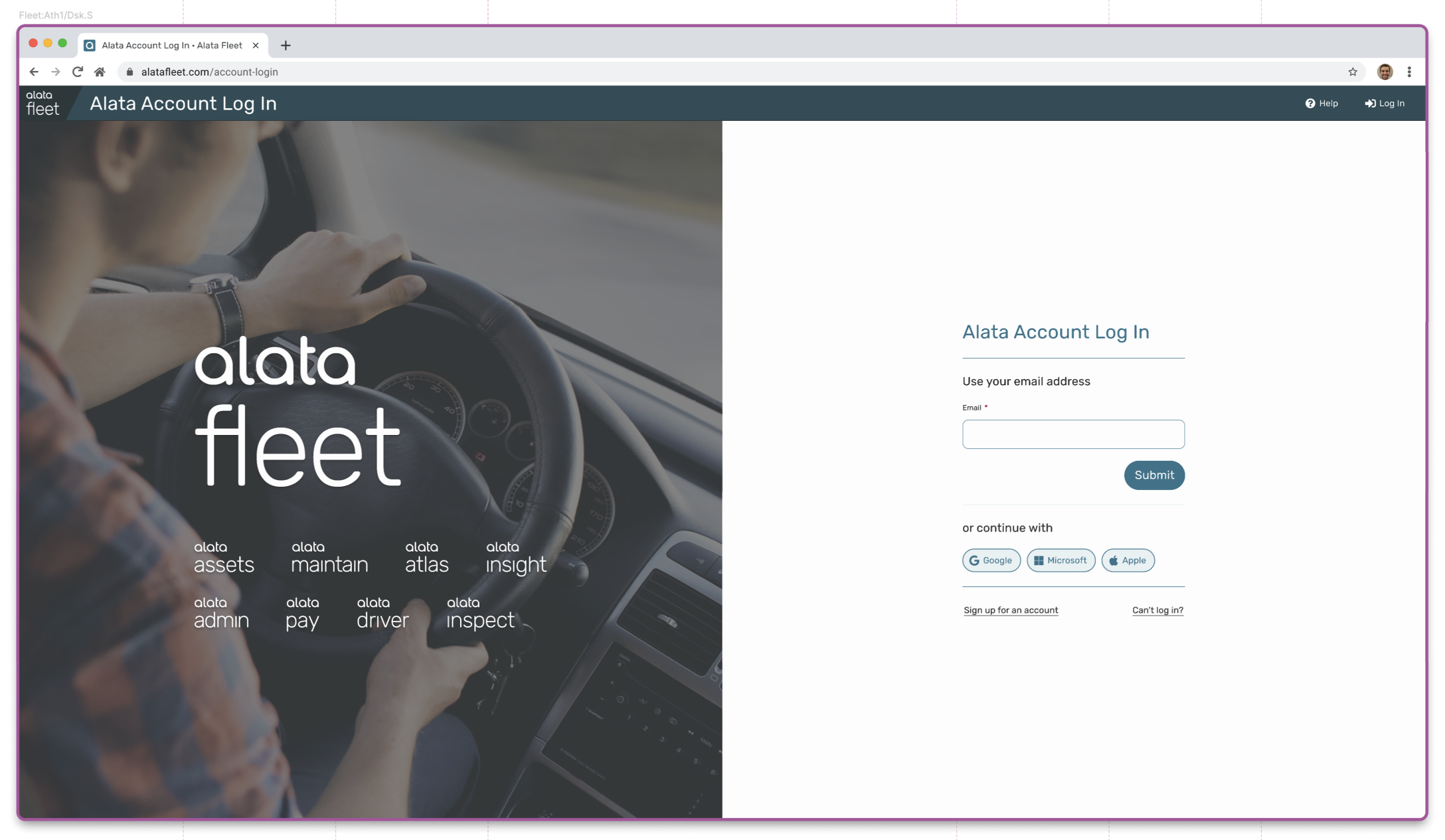
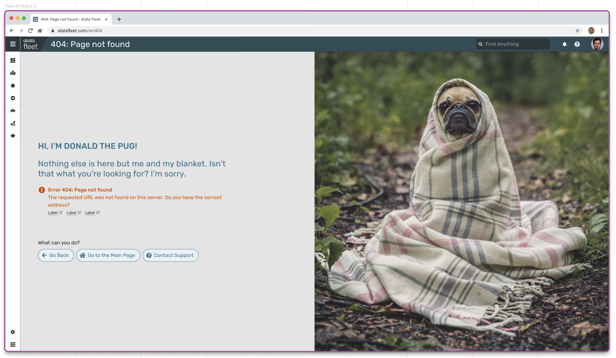
Landing Page:
Used for signing in, errors, etc. Has multiple variants, depending if user is signed-in or not (when not signed in, certain elements such as the SideBar are hidden).
← SCROLL→
High-fidelity example of the template: Sign-in page
← SCROLL→
High-fidelity example of the template: Error 404 page
← SCROLL→
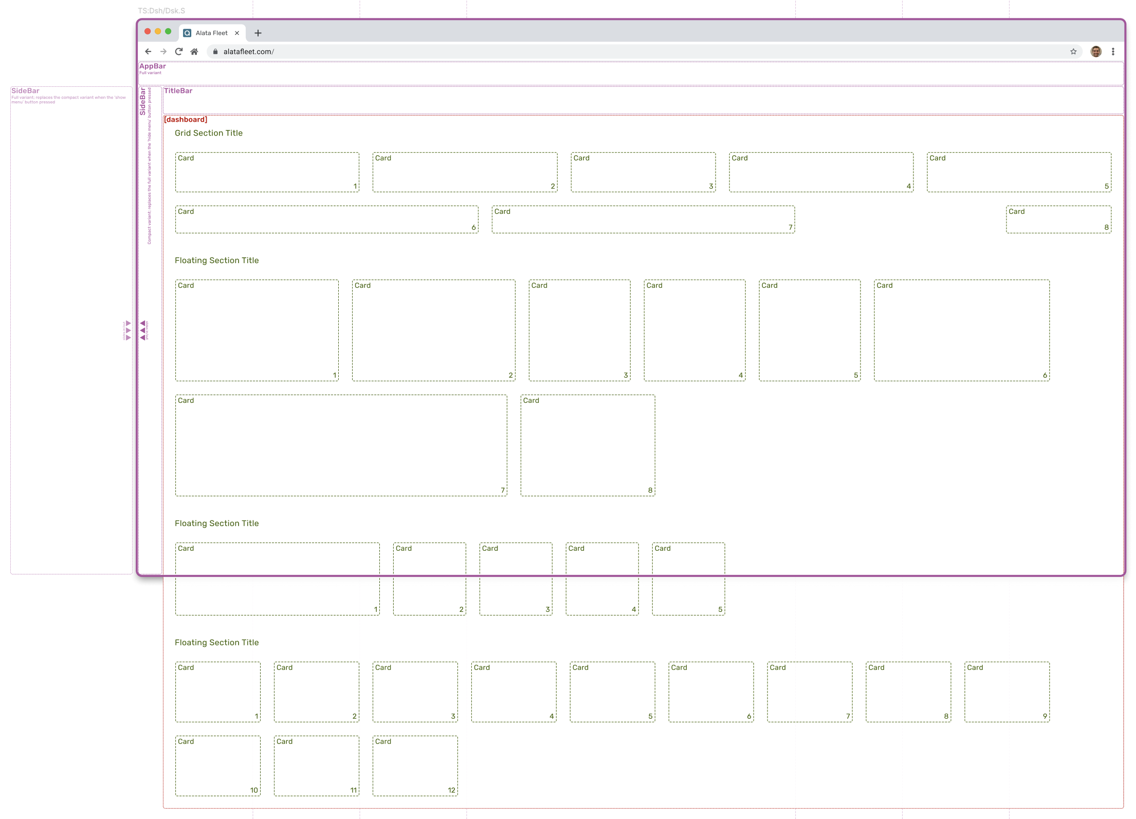
Dashboard Page:
Used for dashboards where various information are presented on Cards. Additionally, a set of bars is also visible.
← SCROLL→
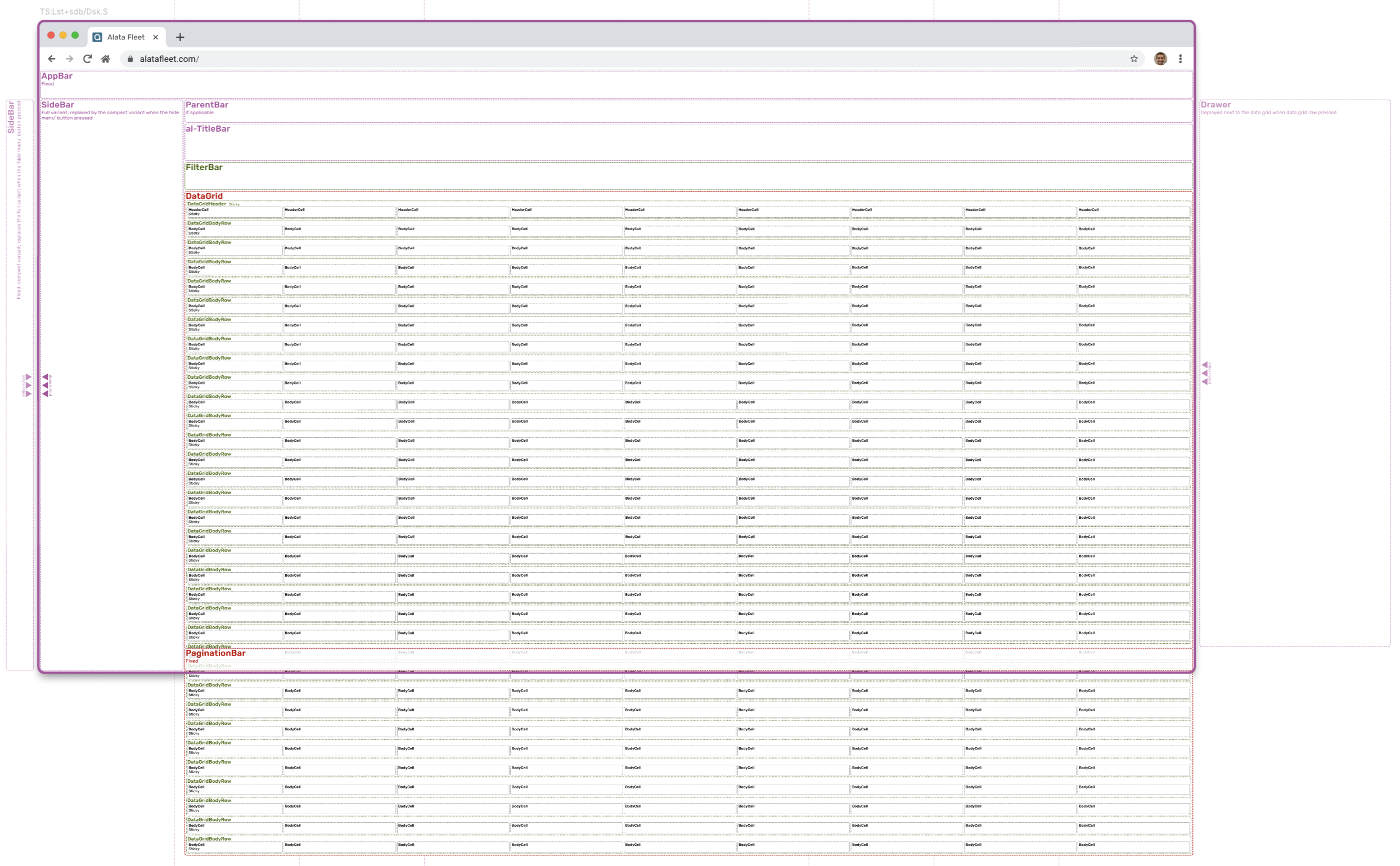
Listing Page:
Used for listing, utilizes various bars and DataGrid. Additionally, a set of bars is visible, and Drawer component is ready to be deployed.
← SCROLL→
Patterns & Flows
Patterns define standard ways to interact with the interface. They are repeatable solutions to common design problems defining how components are combined and used in a consistent way. Flows describe how users move through a sequence of patterns and screens to achieve a goal.
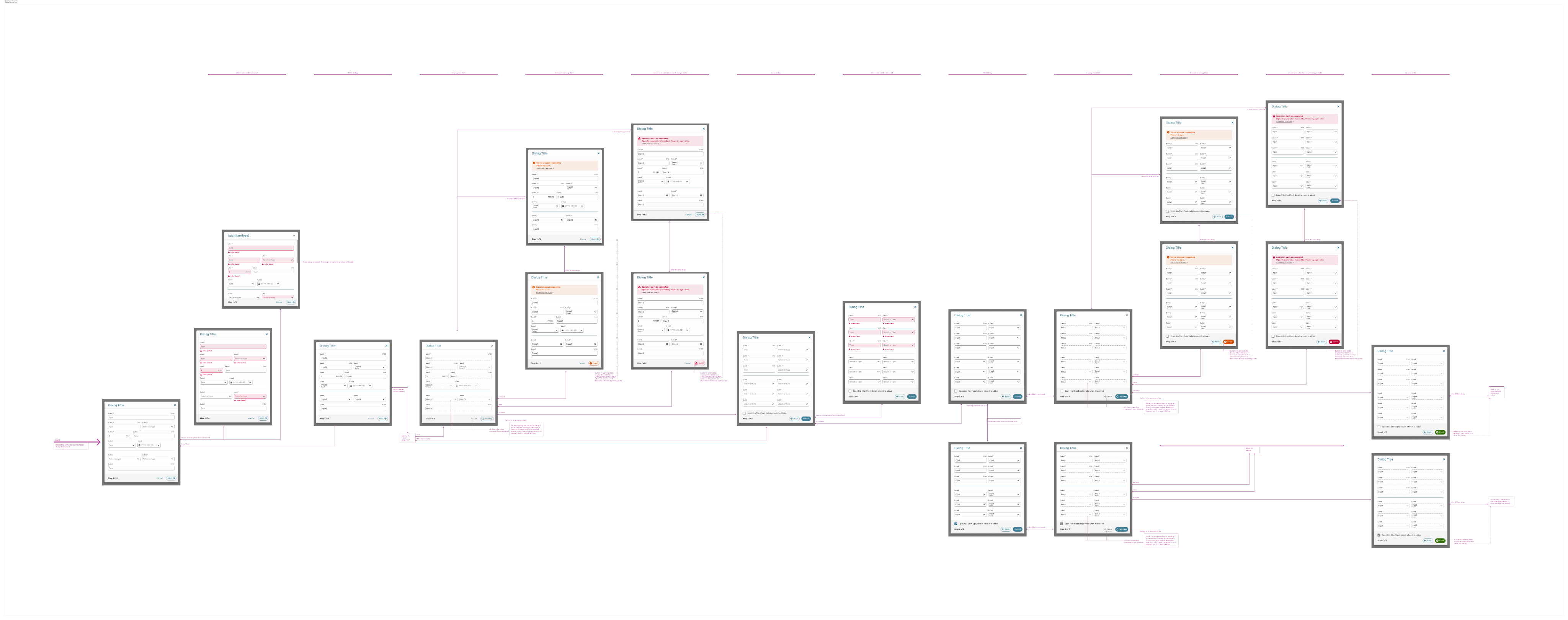
Dialog Interaction:
This flow defines general interaction with a general dialog: ways to indicate errors, deploy messages, inform user about waiting for server response, etc.
← SCROLL→
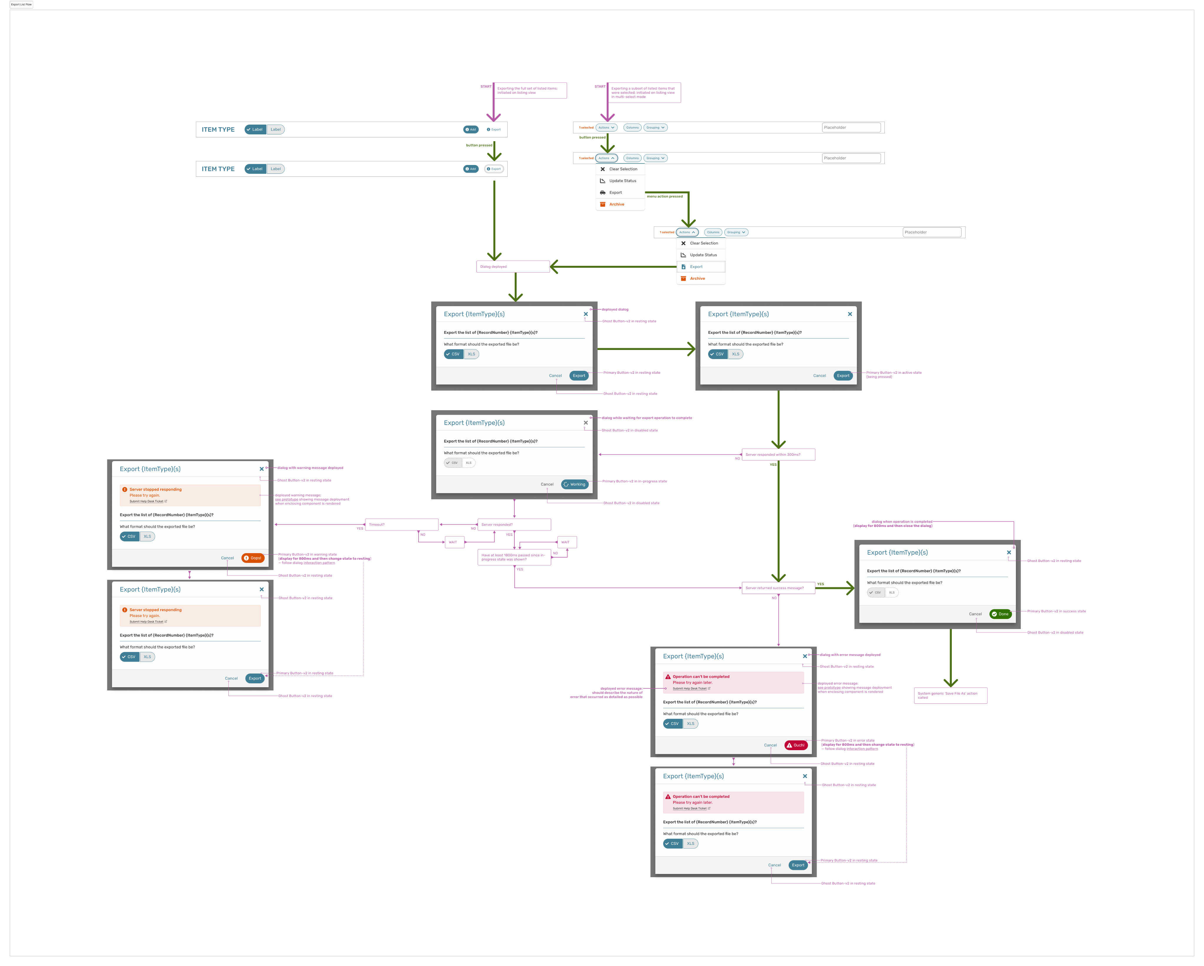
Export Items:
This flow defines specific action of exporting (selected or all) items that are currently listed. It indicates all the actions, component variants depending on a situation, errors and other messages, etc.
← SCROLL→
Projects
DISCLAIMER: All projects and designs shown in this portfolio have been created by myself, or as part of a team; working as a freelance contractor or a full-time employee. They belong to their legal owners and are being shown here for informational purposes only.
Made with Figma Sites
Bart Matusiak Little Leaf
ux/product designer + information architect
LINK Driver
mobile application
DF Booking
web application module
US Wholesale
web application module
Data Dashboard
web application module
IDs
data taxonomy concept
AL DS
design system
AL Design System (AL DS)
Design system as a comprehensive set of components, templates, rules and patterns utilized to construct the Alata LINK (currently: Alata Fleet), a robust fleet management suite of applications. Project for Alata Tech (part of The Driving Force Group of Companies).
My role: define tokens and design components, identify and design templates, establish patterns and standard flows. Test, maintain and grow the system. Collaborate with the development team to implement and utilize the system.
SITUATION
When building a complex and robust fleet management suite of applications that covers the whole lifecycle of assets, it is important to keep all the parts of this product consistent and coherent to ensure a seamless user experience and straighten the learning curve.
TASK
To build a design system based on Atomic Design principles: the idea is to break down user interfaces into small, reusable building blocks (like atoms in chemistry) and then systematically combine them to create more complex structures.
ACTION
Defining tokens, designing component library and templates, establishing patterns and flows. Preparing documentation. Cooperating with the engineering team to build components and utilize them.
RESULT
Implemented design system speeded up developer re-work time by 40%, according to the development team.
i
See below selected fragments of the whole design system.
Tokens
Tokens are the smallest elements of a design system used to define colours, typography, spacing and other building blocks, parameters and variables.
Colours:
← SCROLL→
Typography:
← SCROLL→
Spacing
Elevation:
← SCROLL→
Overlays:
Glyphs:
SVG shapes used as an icon component parameter.
← SCROLL→
Components Dependances
Following atomic design principles, defined components constitute a hierarchy. Some components are dependent, meanig they can’t be applied directly, but they are used within components of higher complication. Independent compontents can be applied directly, but they can also be used to build other, more complicated components.
Following atomic design principles, defined components constitute a hierarchy. Some components are dependent, meanig they can’t be applied directly, but they are used within components of higher complication. Independent compontents can be applied directly, but they can also be used to build other, more complicated components.
← SCROLL→
Atoms & Molecules
Atoms are the most basic UI elements such as buttons, input fields, labels or icons. These are the raw building blocks with no smaller meaning in UI terms. Molecules are groups of atoms working together, ex. a search form (input field + label + button). Molecules provide simple functionality by combining atoms.
Icon:
Icon atom utilizing glyph tokens. Additional parameters (right) allow full control of the component.
Avatar:
Avatar molecule utilizing Icon atom. Additional parameters (right) allow full control of the component.
Button:
Fragment of the button molecule design showing selected variants for secondary style. Buttons utilize multiple Icon atoms, depending on situation.
Prototype animation showing button behaviour and micro-interactions.
Box:
Fragment of the Combo molecule design showing selected variants. There are also other box types available, such as Text, Search, Date, Time, etc. Those components are not supposed to be applied directly.
← SCROLL→
BoxInput:
This component purpose is to apply various kinds of box molecules. Type of the applied box is one of the component parameters (in this case: Text). It adds additional features, such as label, hint, mandatory marking, etc.
← SCROLL→
Organisms
Organisms are relatively complex components made of molecules and atoms (a navigation bar, product card, or header). They establish distinct sections of a UI.
SubmitFooter:
This organism is used by other components whenever there is a need for a submission functionality. The component is built using some atoms and molecules such as SelectBox and Buttons. Shown below are selected variants of the component that cover all identified use cases.
← SCROLL→
Dialog:
Dialog is one of the components that utilizes SubmitFooter organism mentioned above, as well as DialogTitle.
← SCROLL→
Shown below are Dialog examples with various type of content embeded within.
← SCROLL→
Drawer:
Drawer is another component that utilizes SubmitFooter organism mentioned above.
← SCROLL→
Templates
Templates are page-level structures that arrange organisms. They focus on layout rather than final content, ex. a product page template showing where header, sidebar, and content blocks go.
Landing Page:
Used for signing in, errors, etc. Has multiple variants, depending if user is signed-in or not (when not signed in, certain elements such as the SideBar are hidden).
High-fidelity example of the template: Sign-in page
High-fidelity example of the template: Error 404 page
Dashboard Page:
Used for dashboards where various information are presented on Cards. Additionally, a set of bars is also visible.
Listing Page:
Used for listing, utilizes various bars and DataGrid. Additionally, a set of bars is visible, and Drawer component is ready to be deployed.
Patterns & Flows
Patterns define standard ways to interact with the interface. They are repeatable solutions to common design problems defining how components are combined and used in a consistent way. Flows describe how users move through a sequence of patterns and screens to achieve a goal.
Dialog Interaction:
This flow defines general interaction with a general dialog: ways to indicate errors, deploy messages, inform user about waiting for server response, etc.
← SCROLL→
Export Items:
This flow defines specific action of exporting (selected or all) items that are currently listed. It indicates all the actions, component variants depending on a situation, errors and other messages, etc.
← SCROLL→
Projects
DISCLAIMER: All projects and designs shown in this portfolio have been created by myself, or as part of a team; working as a freelance contractor or a full-time employee. They belong to their legal owners and are being shown here for informational purposes only.
Made with Figma Sites
Bart Matusiak Little Leaf
ux/product designer + information architect
DF Booking
web application module
US Wholesale
web application module
Data Dashboard
web application module
IDs
data taxonomy concept
LINK Driver
mobile application
AL DS
design system
AL Design System (AL DS)
Design system as a comprehensive set of components, templates, rules and patterns utilized to construct the Alata LINK (currently: Alata Fleet), a robust fleet management suite of applications. Project for Alata Tech (part of The Driving Force Group of Companies).
My role: define tokens and design components, identify and design templates, establish patterns and standard flows. Test, maintain and grow the system. Collaborate with the development team to implement and utilize the system.
SITUATION
When building a complex and robust fleet management suite of applications that covers the whole lifecycle of assets, it is important to keep all the parts of this product consistent and coherent to ensure a seamless user experience and straighten the learning curve.
TASK
To build a design system based on Atomic Design principles: the idea is to break down user interfaces into small, reusable building blocks (like atoms in chemistry) and then systematically combine them to create more complex structures.
ACTION
Defining tokens, designing component library and templates, establishing patterns and flows. Preparing documentation. Cooperating with the engineering team to build components and utilize them.
RESULT
Implemented design system speeded up developer re-work time by 40%, according to the development team.
i
See below selected fragments of the whole design system.
Tokens
Tokens are the smallest elements of a design system used to define colours, typography, spacing and other building blocks, parameters and variables.
Colours:
← SCROLL→
Typography:
← SCROLL→
Spacing:
Elevation:
Overlays:
Glyphs:
SVG shapes used as an icon component parameter.
← SCROLL→
Components Dependances
Following atomic design principles, defined components constitute a hierarchy. Some components are dependent, meaning they can’t be applied directly, but they are used within components of higher complication. Independent components can be applied directly, but they can also be used to build other, more complicated components.
The diagram shown below is a fragment of the whole structure and shows dependencies between selected components.
Atoms & Molecules
Atoms are the most basic UI elements such as buttons, input fields, labels or icons. These are the raw building blocks with no smaller meaning in UI terms. Molecules are groups of atoms working together, ex. a search form (input field + label + button). Molecules provide simple functionality by combining atoms.
Icon:
Icon atom utilizing glyph tokens. Additional parameters (right) allow full control of the component.
Avatar:
Avatar molecule utilizing Icon atom. Additional parameters (right) allow full control of the component.
Button:
Fragment of the button molecule design showing selected variants for secondary style. Buttons utilize multiple Icon atoms, depending on situation.
Prototype animation showing button behaviour and micro-interactions.
Box:
Fragment of the Combo molecule design showing selected variants. There are also other box types available, such as Text, Search, Date, Time, etc. Those components are not supposed to be applied directly.
← SCROLL→
BoxInput:
This component purpose is to apply various kinds of box molecules. Type of the applied box is one of the component parameters (in this case: Text). It adds additional features, such as label, hint, mandatory marking, etc.
Organisms
Organisms are relatively complex components made of molecules and atoms (a navigation bar, product card, or header). They establish distinct sections of a UI.
SubmitFooter:
This organism is used by other components whenever there is a need for a submission functionality. The component is built using some atoms and molecules such as SelectBox and Buttons. Shown below are selected variants of the component that cover all identified use cases.
← SCROLL→
Dialog:
Dialog is one of the components that utilizes SubmitFooter organism mentioned above, as well as DialogTitle.
← SCROLL→
Shown below are dialog examples with various types of content embedded within.
← SCROLL→
Drawer:
Drawer is another component that utilizes SubmitFooter organism mentioned above.
← SCROLL→
Templates
Templates are page-level structures that arrange organisms. They focus on layout rather than final content, ex. a product page template showing where header, sidebar, and content blocks go.
Landing Page:
Used for signing in, errors, etc. Has multiple variants, depending if user is signed-in or not (when not signed in, certain elements such as the SideBar are hidden).
High-fidelity example of the template: Sign-in page
High-fidelity example of the template: Error 404 page
Dashboard Page:
Used for dashboards where various information are presented on Cards. Additionally, a set of bars is also visible.
Listing Page:
Used for listing, utilizes various bars and DataGrid. Additionally, a set of bars is visible, and Drawer component is ready to be deployed.
Patterns & Flows
Patterns define standard ways to interact with the interface. They are repeatable solutions to common design problems defining how components are combined and used in a consistent way. Flows describe how users move through a sequence of patterns and screens to achieve a goal.
Dialog Interaction:
This flow defines general interaction with a general dialog: ways to indicate errors, deploy messages, inform user about waiting for server response, etc.
← SCROLL→
Export Items:
This flow defines specific action of exporting (selected or all) items that are currently listed. It indicates all the actions, component variants depending on a situation, errors and other messages, etc.
← SCROLL→
Projects
DISCLAIMER: All projects and designs shown in this portfolio have been created by myself, or as part of a team; working as a freelance contractor or a full-time employee. They belong to their legal owners and are being shown here for informational purposes only.
Made with Figma Sites